

| 일 | 월 | 화 | 수 | 목 | 금 | 토 |
|---|---|---|---|---|---|---|
| 1 | ||||||
| 2 | 3 | 4 | 5 | 6 | 7 | 8 |
| 9 | 10 | 11 | 12 | 13 | 14 | 15 |
| 16 | 17 | 18 | 19 | 20 | 21 | 22 |
| 23 | 24 | 25 | 26 | 27 | 28 |
- 시리얼노션
- Unity
- unity #animation #animator #mixamo #character
- 게임개발
- 전시진강의후기
- unity #mixamo #character #texture #material
- 시리얼강의후기
- Android #AndroidStudio #안드로이드스튜디오 #안드로이드스튜디오설치 #안드로이드앱개발
- Today
- Total
HB의 개발 블로그
[Web] 06. HTML CSS 본문
body {
  background-color: lightblue;
}
aCSS (Cascading Style Sheets) : 웹 문서의 전반적인 스타일을 미리 저장해 둔 스타일시트이다. 문서 전체의 일관성을 유지할 수 있고, 세세한 스타일 지정의 필요를 줄일 수 있다.
CSS는 다양한 장치 및 화면 크기에 대한 설계, 레이아웃 및 디스플레이의 변형을 포함하여 웹 페이지의 스타일을 정의하는 데 사용된다. css를 통해서 여러 웹 페이지들의 레이아웃을 한번에 수정 및 관리 할 수 있다.
기본 구조 예시
<!DOCTYPE html>
<html>
<head>
<style>
body {
  background-color: lightblue;
}

h1 {
  color: white;
  text-align: center;
}

p {
  font-family: verdana;
  font-size: 20px;
}
</style>
</head>
<body>

<h1>My First CSS Example</h1>
<p>This is a paragraph.</p>

</body>
</html>
CSS Syntax

The selector points to the HTML element you want to style.
The declaration block contains one or more declarations separated by semicolons.
Each declaration includes a CSS property name and a value, separated by a colon.
Multiple CSS declarations are separated with semicolons, and declaration blocks are surrounded by curly braces.
Example
p{
	color: red;
	text-align: center;
}
CSS Selector
- Selector의 종류
- Simple selectors (이름, ID, 클래스를 기준으로 선택)
- Combinator selectors (특정 관계를 기준으로 선택)
- Pseudo-class selectors (특정 상태를 기준으로 선택)
- Pseudo-elements selectors (요소의 일부를 선택하고 스타일을 지정)
- Attribute-selectors (특성 또는 속성 값을 기반으로 요소 선택)
How to add CSS
- External CSS
- Internal CSS
- Inline CSS
External CSS example
<!DOCTYPE html>
<html>
<head>
<link rel="stylesheet" type="text/css" href="mystyle.css">
</head>
<body>

<h1>This is a heading</h1>
<p>This is a paragraph.</p>

</body>
</html>
Internal CSS example
<!DOCTYPE html>
<html>
<head>
<style>
body {
  background-color: linen;
}

h1 {
  color: maroon;
  margin-left: 40px;
}
</style>
</head>
<body>

<h1>This is a heading</h1>
<p>This is a paragraph.</p>

</body>
</html>
Inline CSS example
<!DOCTYPE html>
<html>
<body>

<h1 style="color:blue;text-align:center;">This is a heading</h1>
<p style="color:red;">This is a paragraph.</p>

</body>
</html>
CSS Comments
주석 표시 : /* */
/* This is a single-line comment */
p {
  color: red;
}
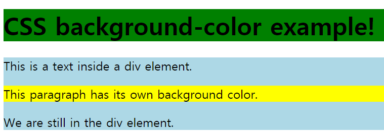
CSS Backgrounds
바탕 색 지정 example
body {
  background-color: lightblue;
}
Elements 색 지정 example
h1 {
background-color: green;
}
div {
background-color: lightblue;
}
p {
background-color: yellow;
}
투명도 조절 : opacity 지정
div {
  background-color: green;
  opacity: 0.3;
}
이미지 추가
body {
  background-image: url("ex.jpg");
}
CSS Borders
테두리 설정
p.dotted {border-style: dotted;}
p.dashed {border-style: dashed;}
p.solid {border-style: solid;}
p.double {border-style: double;}
p.groove {border-style: groove;}
p.ridge {border-style: ridge;}
p.inset {border-style: inset;}
p.outset {border-style: outset;}
p.none {border-style: none;}
p.hidden {border-style: hidden;}
p.mix {border-style: dotted dashed solid double;}
CSS Margins
Margin: 테두리(경계) 외부에서 요소 주변으로 공간을 만드는 요소
기본 속성
- margin-top
- margin-left
- margin-right
- margin-bottom
Example:
p {
  margin-top: 100px;
  margin-bottom: 100px;
  margin-right: 150px;
  margin-left: 80px;
}

//속성을 하나만 줄 경우, 4방향에 대한 속성값으로 지정
p {
  margin: 25px 50px 75px 100px;
}


//auto를 이용하여 자동으로 센터에 margin을 맞출 수 있다.
p {
  margin: 25px 50px 75px 100px;
}
CSS Padding
Padding: Margin과 반대로 테두리(경계) 내부에서 요소 주변으로 공간을 만드는 요소
기본 속성
- padding-top
- padding-left
- padding-right
- padding-bottom
div {
  padding-top: 50px;
  padding-right: 30px;
  padding-bottom: 50px;
  padding-left: 80px;
}

//margin과 마찬가지고 속성을 하나만 줄 경우, 4방향에 대한 속성값으로 지정
div {
  padding: 25px 50px 75px 100px;
}
CSS Height and width
특성 요소의 높이와 넓이 설정.
- auto → 기본값으로 설정. 브라우저가 높이와 너비를 계산함
- length → 높이, 너비를 px, cm 등으로 정의함.
- % → 포함 블록의 높이 / 폭을 퍼센트로 정의
- initial → 높이 / 너비를 기본값으로 설정
- inherit → 부모 값에서 상속받은 값으로 설정
div {
  max-width: 500px;
  height: 100px;
  background-color: powderblue;
}
CSS Images
#borderimg {
  border: 10px solid transparent;
  padding: 15px;
  border-image: url(border.png) 30 round;
}

#borderimg2 {
  border: 10px solid transparent;
  padding: 15px;
  border-image: url(border.png) 20% round;
}
CSS Colors
syntax
background-image: radial-gradient(shape size at position, start-color, …, last-color);
<style>
#grad {
  background-image: radial-gradient(red, yellow, green);
}
CSS Text effects
p.test1 {
  width: 140px;
  border: 1px solid #000000;
  word-break: keep-all;
}

p.test2 {
  width: 140px;
  border: 1px solid #000000;
  word-break: break-all;
}
CSS Transforms
div {
  transform: rotate(20deg);
}
2D
The translate() method moves an element from its current position (according to the parameters given for the X-axis and the Y-axis).
The rotate() method rotates an element clockwise or counter-clockwise according to a given degree.
The scale() method increases or decreases the size of an element (according to the parameters given for the width and height).
The scaleX() method increases or decreases the width of an element.
The scaleY() method increases or decreases the height of an element.
The skewX() method skews an element along the X-axis by the given angle.
The skewY() method skews an element along the Y-axis by the given angle.
The matrix() method combines all the 2D transform methods into one.
3D
rotateX(): x축 중심으로 회전
rotateY(): y축 중심으로 회전
rotateZ(): z축 중심으로 회전
CSS Transition
지정된 시간동안 속성을 변환하는 방식이다. duration 과 효과를 정의해야한다.
<style>
div {
  width: 100px;
  height: 100px;
  background: red;
  transition-property: width;
  transition-duration: 2s;
  transition-timing-function: linear;
  transition-delay: 1s;
}

div:hover {
  width: 300px;
}
CSS Animation
<style>
div {
  width: 100px;
  height: 100px;
  background-color: red;
  position: relative;
  animation-name: example;
  animation-duration: 4s;
}

@keyframes example {
  0%   {background-color:red; left:0px; top:0px;}
  25%  {background-color:yellow; left:200px; top:0px;}
  50%  {background-color:blue; left:200px; top:200px;}
  75%  {background-color:green; left:0px; top:200px;}
  100% {background-color:red; left:0px; top:0px;}
}
CSS Tooltip
마우스 커서를 올릴 경우 부가적인 정보를 보여주기 위해서 사용된다.
<style>
.tooltip {
  position: relative;
  display: inline-block;
  border-bottom: 1px dotted black;
}

.tooltip .tooltiptext {
  visibility: hidden;
  width: 120px;
  background-color: black;
  color: #fff;
  text-align: center;
  border-radius: 6px;
  padding: 5px 0;

  position: absolute;
  z-index: 1;
}

.tooltip:hover .tooltiptext {
  visibility: visible;
}
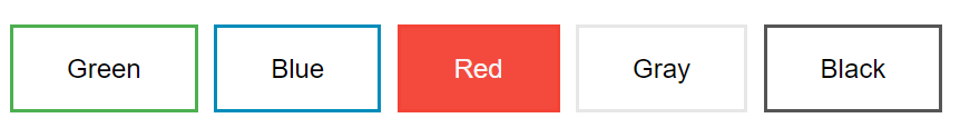
CSS Buttons
기본적인 버튼과 다르게 스타일리쉬한 버튼을 만들 수 있다.
.button {
  background-color: #4CAF50; /* Green */				//버튼의 색 설정
  border: none;								//가장자리 색 설정
  color: white;
  padding: 15px 32px;							//padding설정
  text-align: center;
  text-decoration: none;
  display: inline-block;
  font-size: 16px;							//버튼의 크기 설정
}

hover를 이용하여 커서의 이동에 따른 스타일도 변경이 가능하다.
CSS Variables
The var() Function Variables in CSS should be declared within a CSS selector that defines its scope. For a global scope you can use either the :root or the body selector.
:root {
  --main-bg-color: coral;
}

#div1 {
  background-color: var(--main-bg-color);
}

#div2 {
  background-color: var(--main-bg-color);
}
CSS Flex box
<style>
.flex-container {
  display: flex;
  flex-wrap: wrap;
  background-color: DodgerBlue;
}

.flex-container > div {
  background-color: #f1f1f1;
  width: 100px;
  margin: 10px;
  text-align: center;
  line-height: 75px;
  font-size: 30px;
}
</style>

<div class="flex-container">
  <div>1</div>
  <div>2</div>
  <div>3</div>
  <div>4</div>
  <div>5</div>
  <div>6</div>
  <div>7</div>
  <div>8</div>
  <div>9</div>
  <div>10</div>
  <div>11</div>
  <div>12</div>
</div>
CSS Rounded Corners
경계면을 둥글게 설정
#rcorners1 {
  border-radius: 25px;
  background: #73AD21;
  padding: 20px;
  width: 200px;
  height: 150px;
}

#rcorners2 {
  border-radius: 25px;
  border: 2px solid #73AD21;
  padding: 20px;
  width: 200px;
  height: 150px;
}

border-radius 속성
- border-top-left-radius
- border-top-right-radius
- border-bottom-right-radius
- border-bottom-left-radius
CSS Border Images
이미지를 활용하여 border를 만드는 것도 가능하다.
- 테두리로 활용할 이미지 선택
- 이미지를 자를 부분을 선택
CSS Gradients
Gradients 를 활용하면 색을 자연스럽게 변하도록 설정이 가능하다.
- 선형 Gradients
- 최소 2개 이상의 색 선택
- 색이 변하는 방향 설정 (default: top to bottom)
#grad {
  background-image: linear-gradient(red, yellow);
}

#grad {
  background-image: linear-gradient(to bottom right, red, yellow);
}

투명도를 활용하면 더 미적인 효과를 줄 수도 있다.
#grad {
  background-image: linear-gradient(to right, rgba(255,0,0,0), rgba(255,0,0,1));
}
- 방사형 Gradients
- 중심으로부터 퍼지는 효과를 주는 gradients
- 선형과 마찬가지로 2가지 이상의 색 설정
#grad {
  background-image: radial-gradient(red, yellow, green);
}
CSS Shadow Effects
CSS에서는 다양한 그림자 효과를 사용할 수 있다.
text-shadow
h1 {
  text-shadow: 2px 2px;
}
box-shadow
div {
  box-shadow: 10px 10px;
	}
CSS Text Effects
shadow효과 뿐만 아니라 다양한 효과들을 사용할 수 있다.
Text-overflow : 텍스트 상자 크기보다 문자열이 더 길 경우 나머지 부분을 ... 처리하여 표시하는 효과
p.test2 {
  white-space: nowrap;
  width: 200px;
  border: 1px solid #000000;
  overflow: hidden;
  text-overflow: ellipsis;
}
word-wrap: 긴 단어를 분리하여 다음 줄로 줄 바꿈하여 표현하는 효과
p {
  word-wrap: break-word;
}
CSS Pagination
페이지가 여러 장일 경우, 각 페이지에 대한 숫자를 매길 수 있다.
.pagination {
  display: inline-block;
}

.pagination a {
  color: black;
  float: left;
  padding: 8px 16px;
  text-decoration: none;
}
CSS Responsive Web Design
Responsive Web Design이란?
- 모든 디바이스에서 보기 좋도록 만든다.
- HTML과 CSS만을 사용한다.
- 프로그램이나 JavaScript가 아니다.

Viewport
- The viewport is the user's visible area of a web page.

Grid-View
웹 페이지를 기둥처럼 나누어 표현하는 방식.
* {
  box-sizing: border-box;
}
예시: https://www.w3schools.com/css/tryit.asp?filename=tryresponsive_styles
Tryit Editor v3.6
* { box-sizing: border-box; } .row::after { content: ""; clear: both; display: table; } [class*="col-"] { float: left; padding: 15px; } .col-1 {width: 8.33%;} .col-2 {width: 16.66%;} .col-3 {width: 25%;} .col-4 {width: 33.33%;} .col-5 {width: 41.66%;} .col
www.w3schools.com
Media - Queries
The Media query is a CSS technique introduced in CSS3.
예시: 브라우저 창이 600px보다 작거나 같으면 배경색을 lightblue로 설정.
@media only screen and (max-width: 600px) {
  body {
    background-color: lightblue;
  }
}
Add a Breakpoint
반응형 웹을 만들면 디바이스에 따라서 브라우저 크기를 조절하게 되는데, 다음과 같이 breakpoint를 설정해 보기 좋게 만들어 준다.
element를 숨긴다거나 브라우저 창 사이즈에 따라서 폰트를 조절하는 등 여러가지 기능을 설정할 수 있다.
Images, Videos
If the width property is set to a percentage and the height is set to "auto", the image will be responsive and scale up and down
다양하게 브라우저 크기에 맞춰서 이미지 사이즈를 조절하도록 설정할 수 있다.
img {
  width: 100%;
  height: auto;
}


video {
  max-width: 100%;
  height: auto;
}
'Web' 카테고리의 다른 글
| [Web] 08.JavaScript (Functions~JSON) (0) | 2020.07.28 |
|---|---|
| [Web] 07. Javascript (Introduction~ Data Types) (0) | 2020.07.28 |
| [Web] 05. HTML Graphics (0) | 2020.07.26 |
| [WEB] 04. HTML Forms (0) | 2020.07.21 |
| [WEB] 03. HTML TAG (0) | 2020.07.21 |
